We'll delve into the captivating realm of color, a powerful tool that can significantly impact your logo's effectiveness.
Color: A Silent Communicator
Colors aren't just visual elements; they're powerful communicators that evoke emotions and influence perception. Choosing the right colors for your logo is crucial, as it can shape how your brand is seen and remembered.
Understanding Color Psychology
Different colors have established psychological associations. Here's a glimpse into some common color meanings:
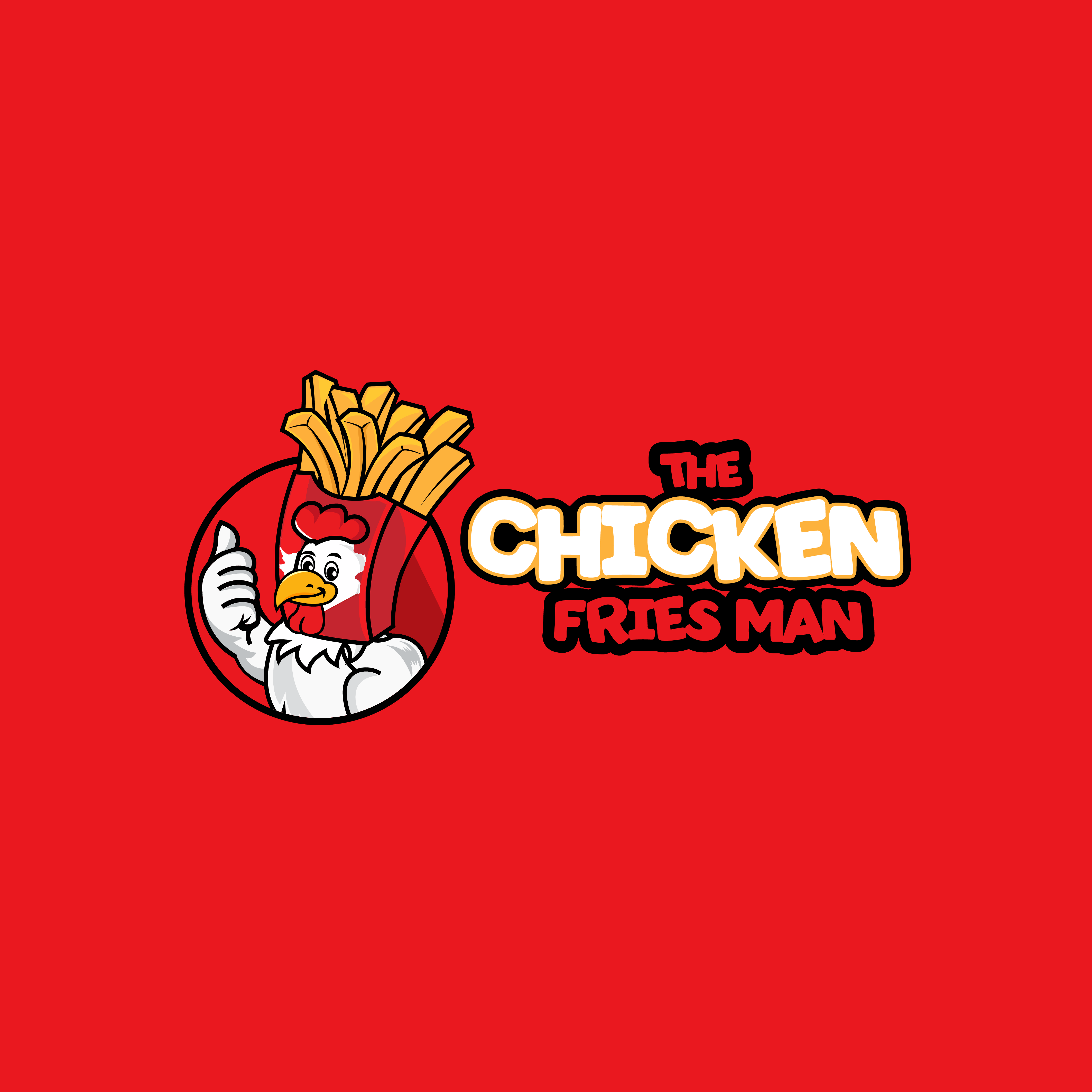
Red: Excitement, passion, energy (think Coca-Cola, Ferrari)
Black: Power, elegance, sophistication (think Chanel, Yves Saint Laurent)
Making your Color Palette
There are various approaches to creating a color palette for your logo:
Monochromatic: Using different shades of a single color creates a clean and sophisticated look (think Tiffany & Co.)
Analogous: Choosing colors next to each other on the color wheel fosters a sense of harmony (think Instagram)
Complementary: Selecting colors opposite each other on the wheel creates a high-contrast and vibrant palette (think FedEx, Red Bull)
Triadic: Using three colors evenly spaced on the wheel produces a dynamic and energetic feel (think Pepsi, Spotify)
Choosing the Right Colors for Your Brand
Brand Identity: What emotions and values does your brand represent? Choose colors that align with your brand message.
Target Audience: Who are you trying to reach? Certain colors might resonate more with specific demographics.
Industry Standards: Some industries have established color associations. Consider these if relevant to your brand.
Beyond the Basics: Color Palettes and Variations:
Developing a logo color palette isn't just about the primary logo itself. Consider creating a secondary palette with complementary colors for use in marketing materials and brand applications. This ensures brand consistency while offering some flexibility.
Want to See More of Our Works?
Here at JeriCreative, we understand the critical role a logo plays in shaping brand perception. Our design team is passionate about crafting logos that are not only visually appealing but also strategically designed to resonate with your target audience and embody your brand's unique identity.
Remember, color is a journey, not a destination! Experiment with different color combinations and see what resonates with your brand identity. In the next part of this series, we'll explore other key logo elements like typography and negative space. We'll also provide practical tips on finding design inspiration and creating a logo that stands out!


Leave a Reply